I got very excited when Jana asked me to completely redesign her brand! She wanted a completely new concept, and we had a lot of fun with it.

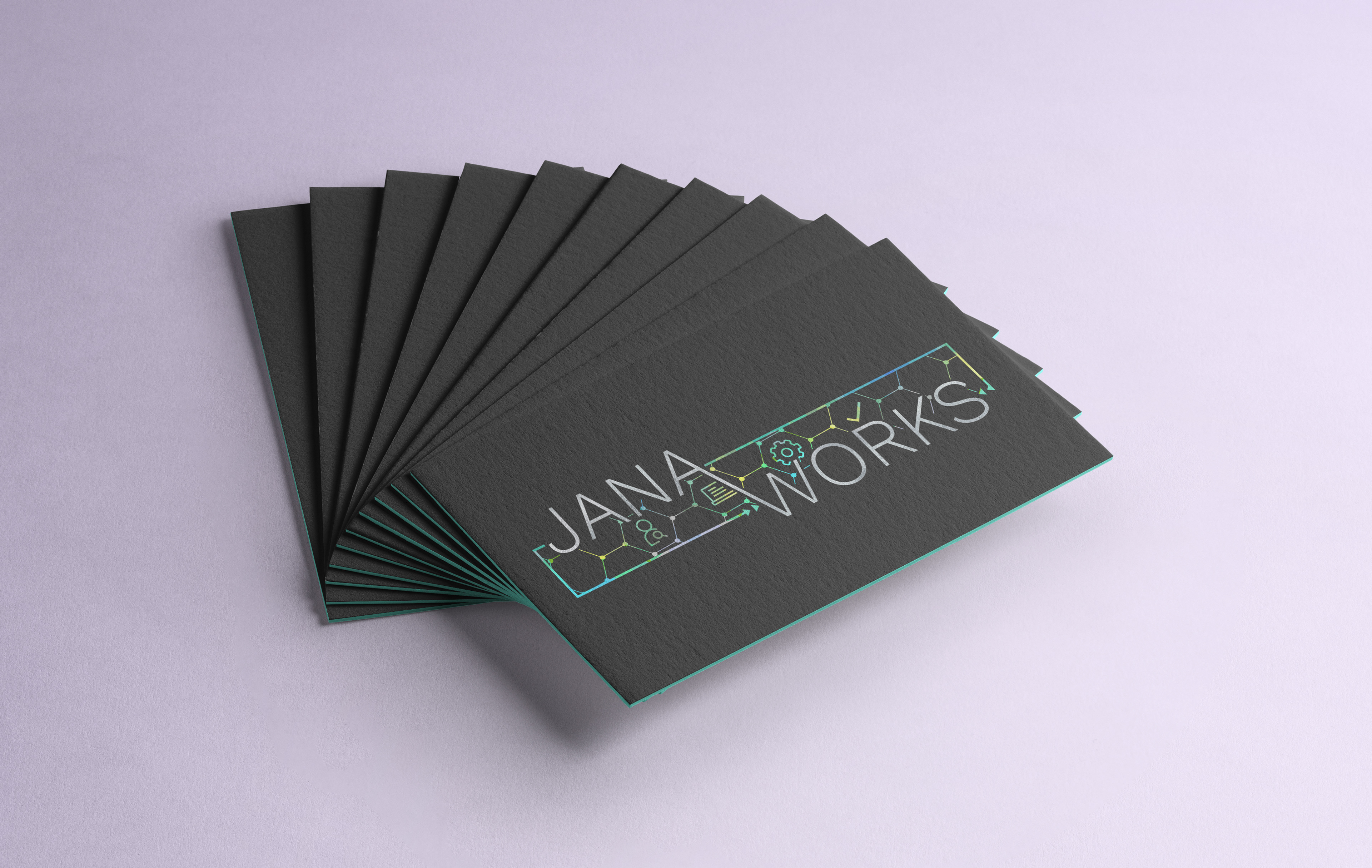
The logo includes symbols explaining the process of what Jana Works can do for their clients: find the help they need, set up systems, and get their business ready for the online world.
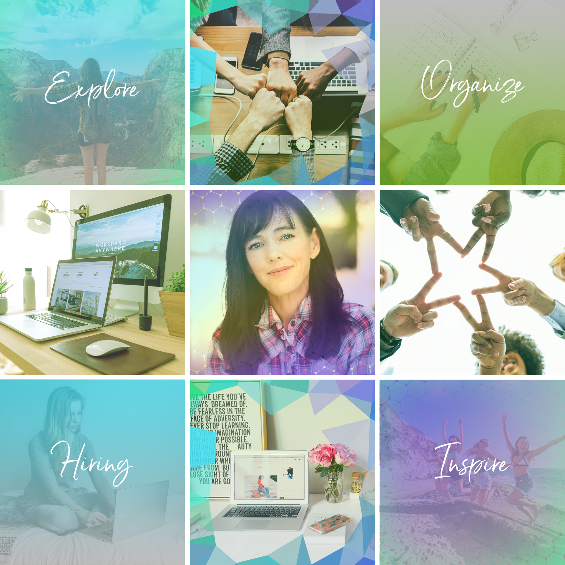
Jana specifically wanted bright colors that popped out! I think we managed to create a brand that included all those colors in a balanced way.
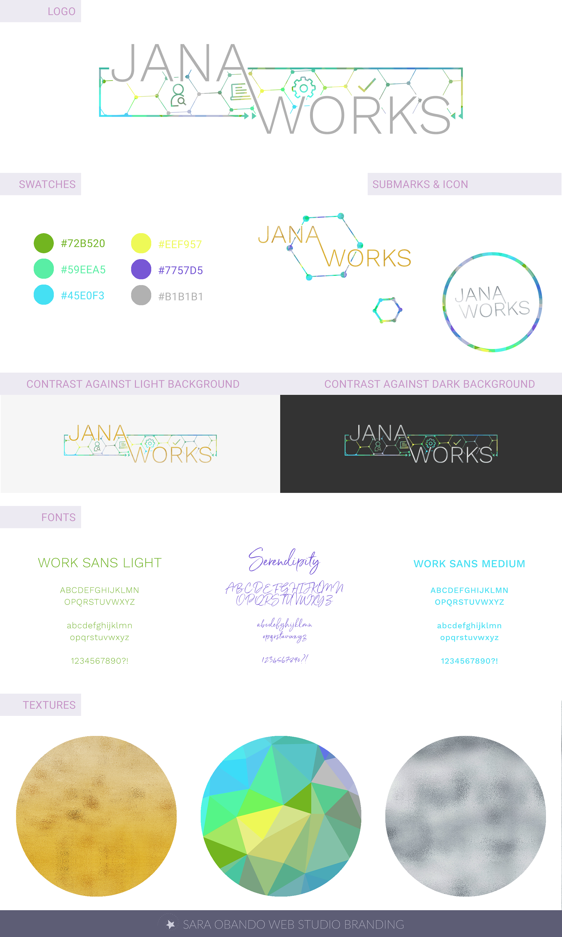
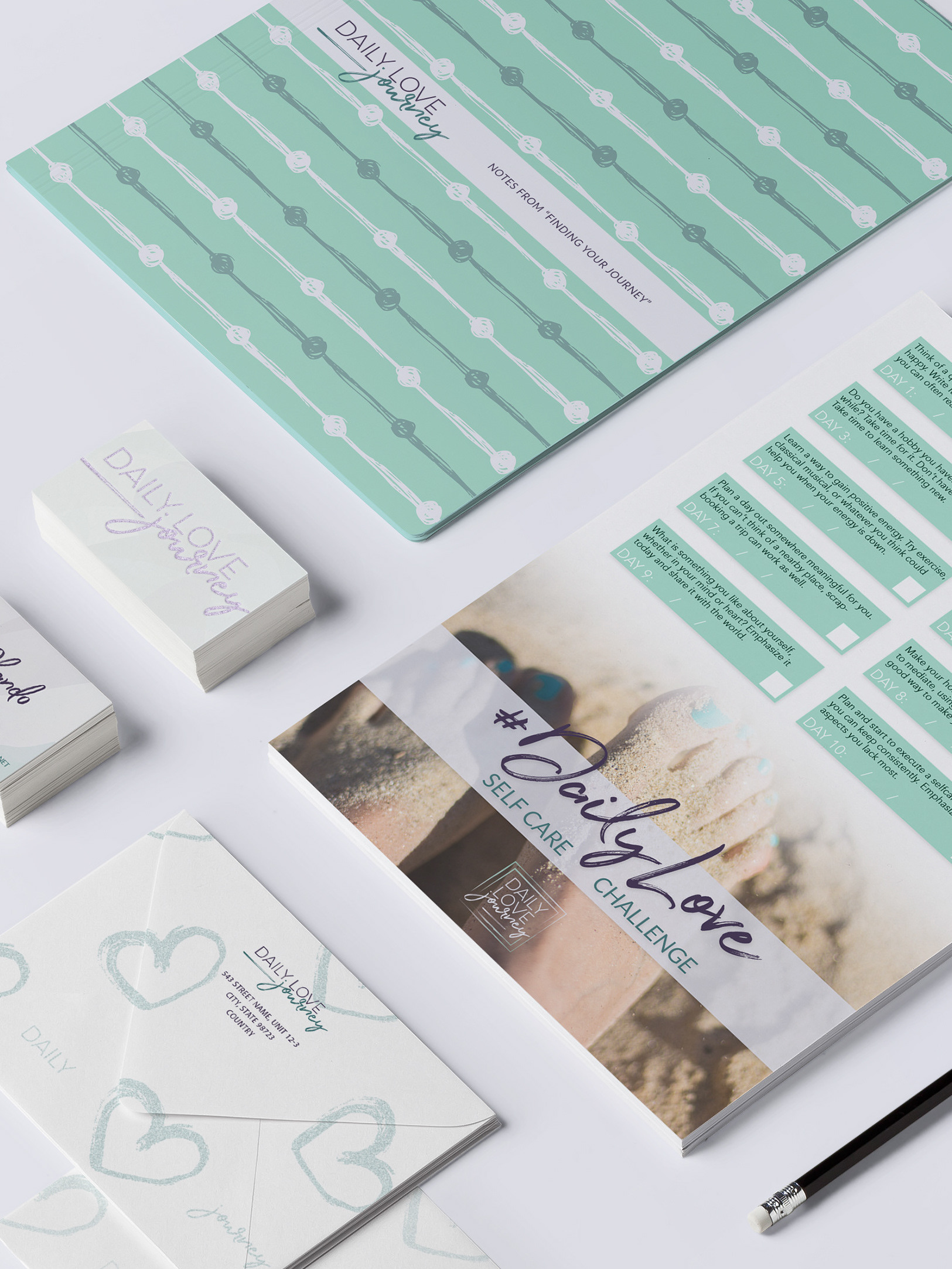
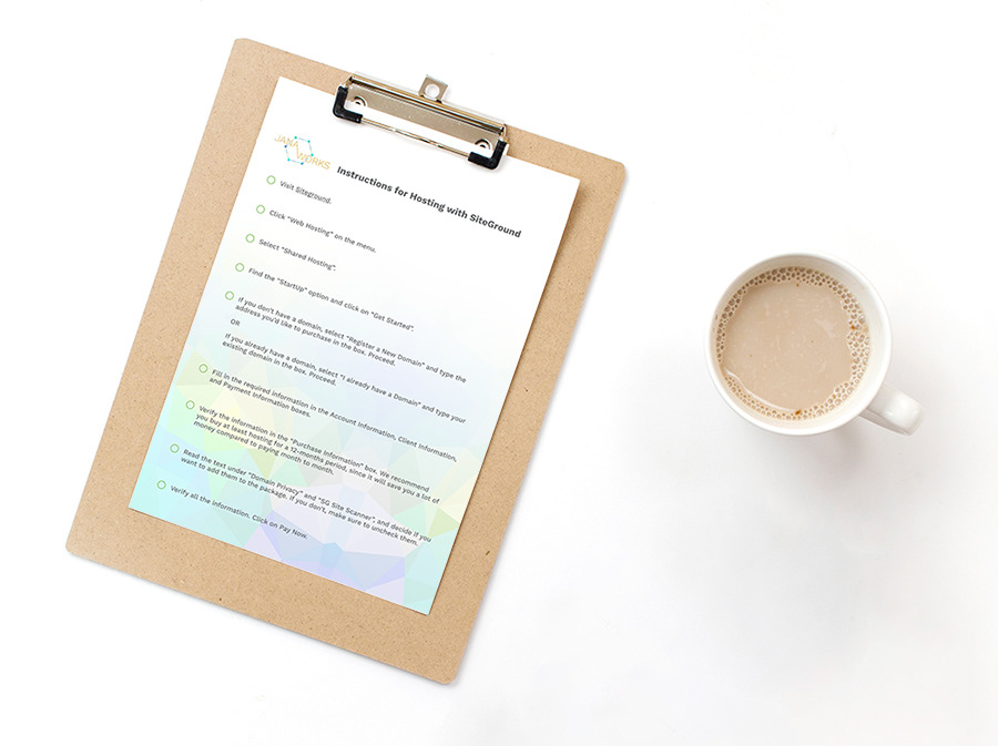
The central texture design was one of the highlights. It was an important piece, since it’s what is used for the background of the logo structure (the enclosed hexagons behind the logo title). The gold and silver texture are mostly used as an overlay over “Jana Works” in the logo. But the central logo is also used as background for different aspects. Below, the texture used as a background for this Jana Works PDF.
With the central texture, the bright colors, and the pattern from the logo I also created a set of overlays to use on social media images. All the overlays worked based on transparency-only, since Jana and her assistants don't always have access to Photoshop and needed something they could use in programs like Canva.
Lastly, it was around that time that I started setting up my “Link for Social Media” service, and Jana was one of my first clients using that service. I set up a page on her website that was specifically design for social media links to land on, and a system to easily add, edit and re-arrange the links shared on that page.

This was a huge project, that was a lot of fun to work on. So many elements were part of this brand! It definitely marked a big difference between her previous brand and this new one, bringing to life the new vision she had for her business.