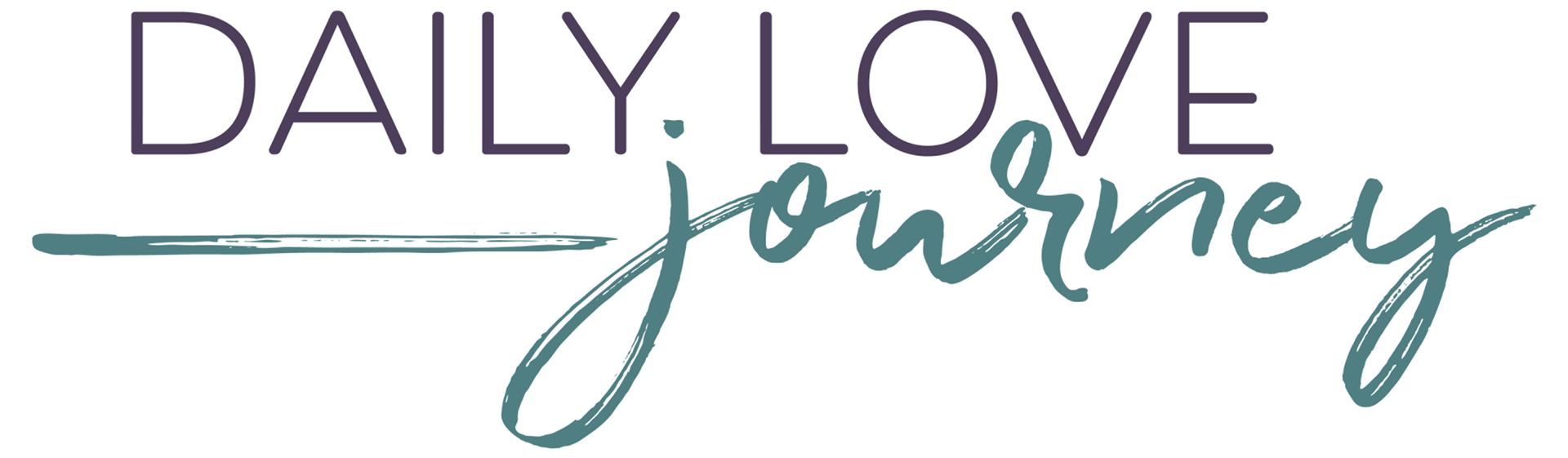
Daily Lovejuice made the transition late last year to Daily Love Journey, and this is the branding I created for it. The keywords were modern, feminine, and fun. I do feel like it also looks a bit adventurous, what do you think?
The colors are completely different to the ones the brand had before, bubbly pink and light blue. It still carries the “fun” element that the previous brand had, but it’s slightly more modern and mature.
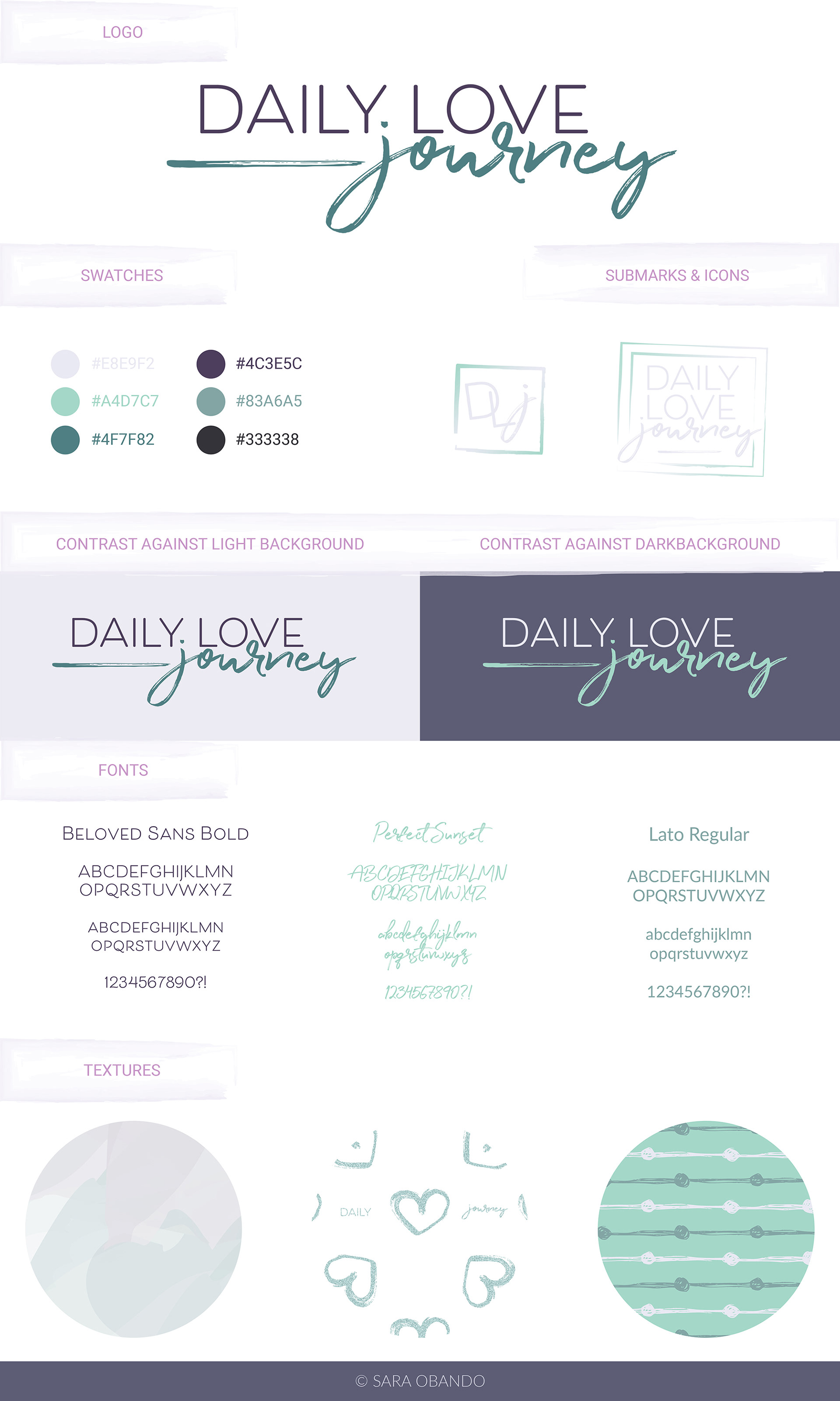
The textures were a lot of fun. The first one has a “watercolor” effect, I did that one from scratch since it doesn’t have many complicated details. For the second one I used two different textures I purchased from either Design Cuts or Creative Market, one with the hearts and another one of glitter, and overlayed them for glittery hearts. I also added the “Daily” and “journey”. This second texture is meant to be used on packaging and paper. The third one is also a texture I purchased from Design Cuts, and I changed the colors in it to make it match the brand colors.
Even though I enjoy designing my own textures, I also have a huge collection of high quality textures I’ve purchased because I can never get enough of them! So, I force myself to modify them and use them as well, otherwise I can’t justify purchasing more.
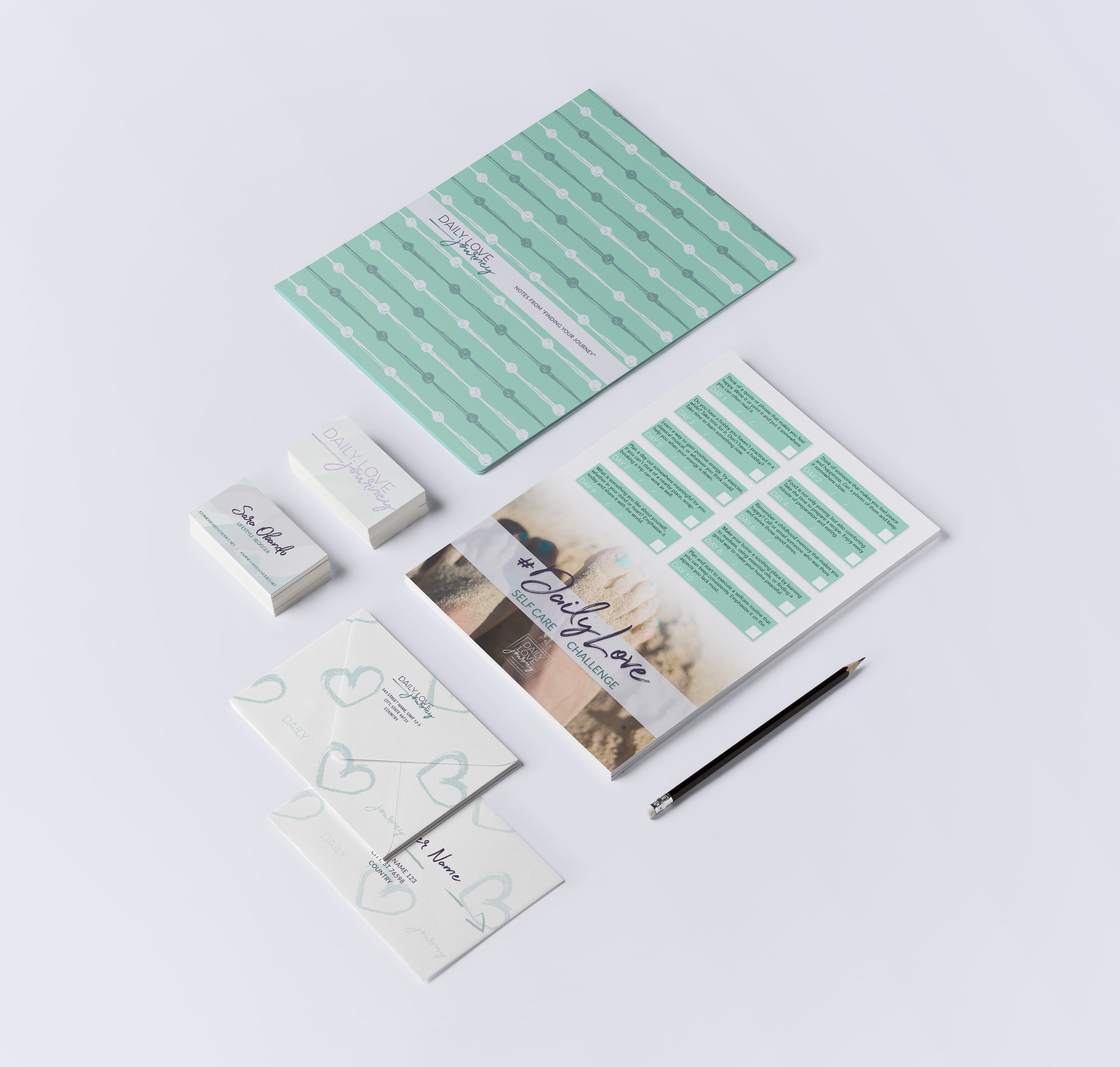
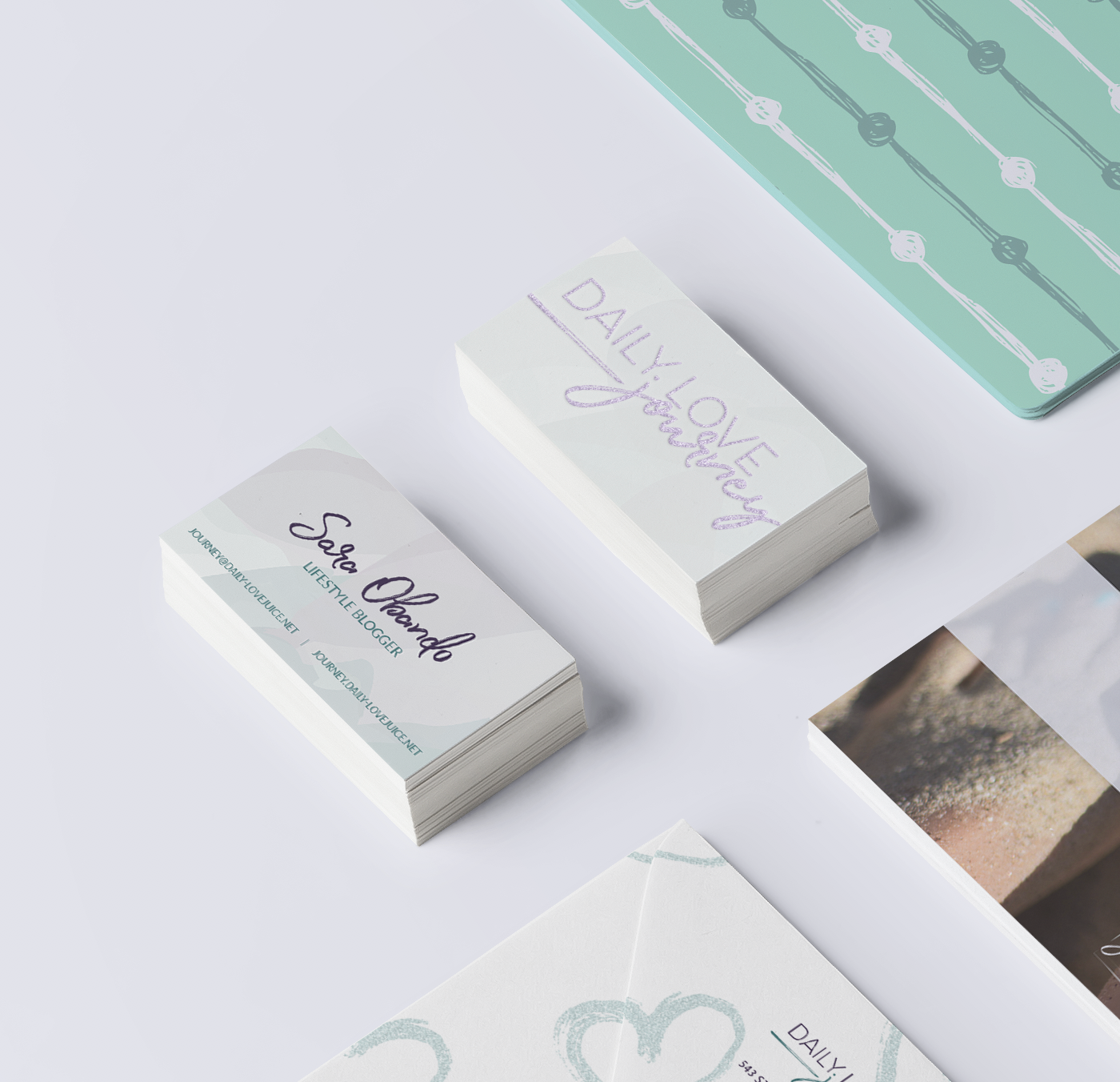
Stationery design to display how the textures can be applied. Business cards are using the first texture, envelopes the second texture, and the folder the third texture. I also included a possibly recreation of the #DailyLove print out, although that print out is actually going to be completely redone content wise as well.
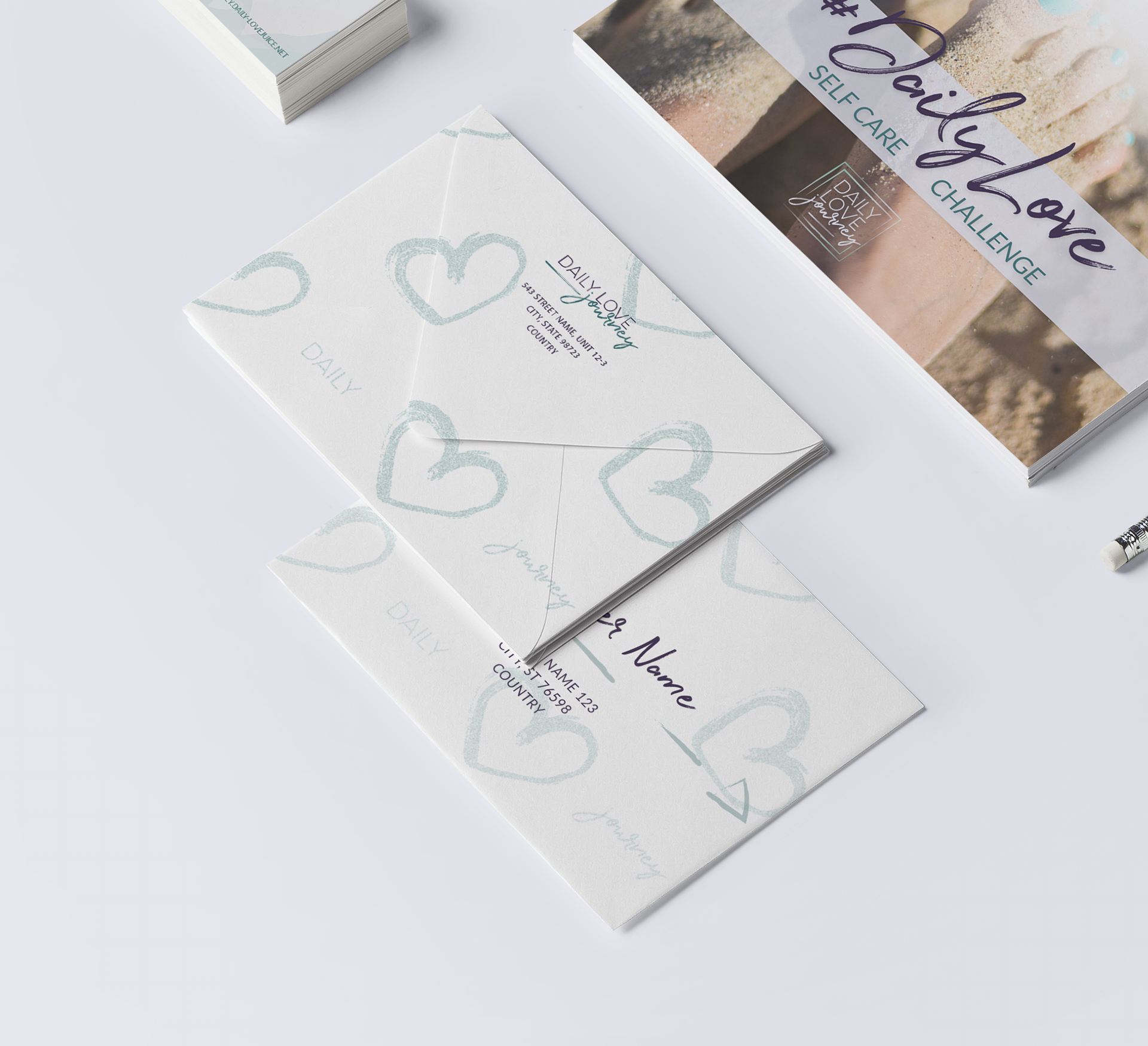
Below are close ups of the envelopes and business cards.
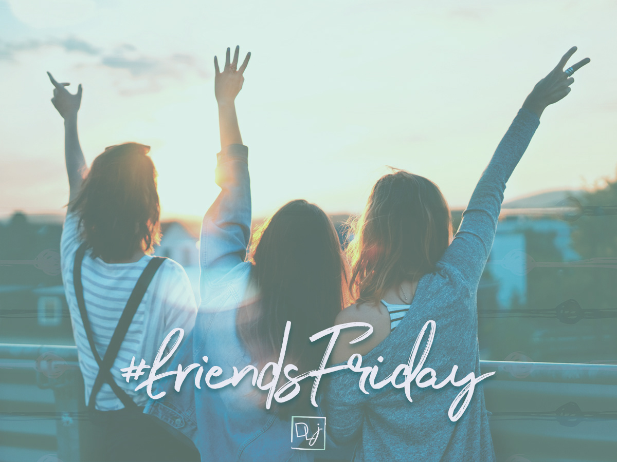
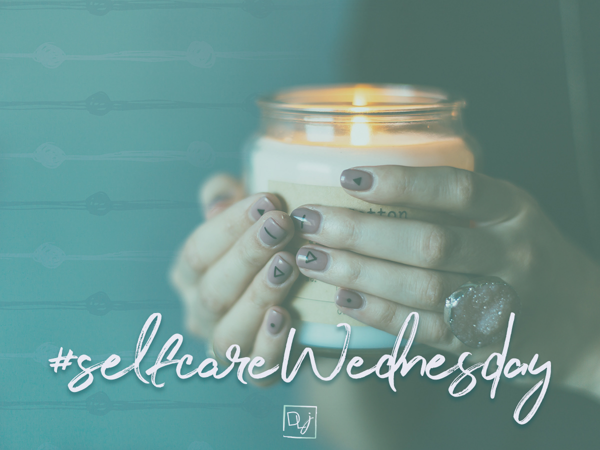
These are some of the social media graphics created for the brand as well. They have both an overlay in one of the brand colors and the third texture, to make almost any photo match the brand. The submark is enough to make the graphic recognizable.
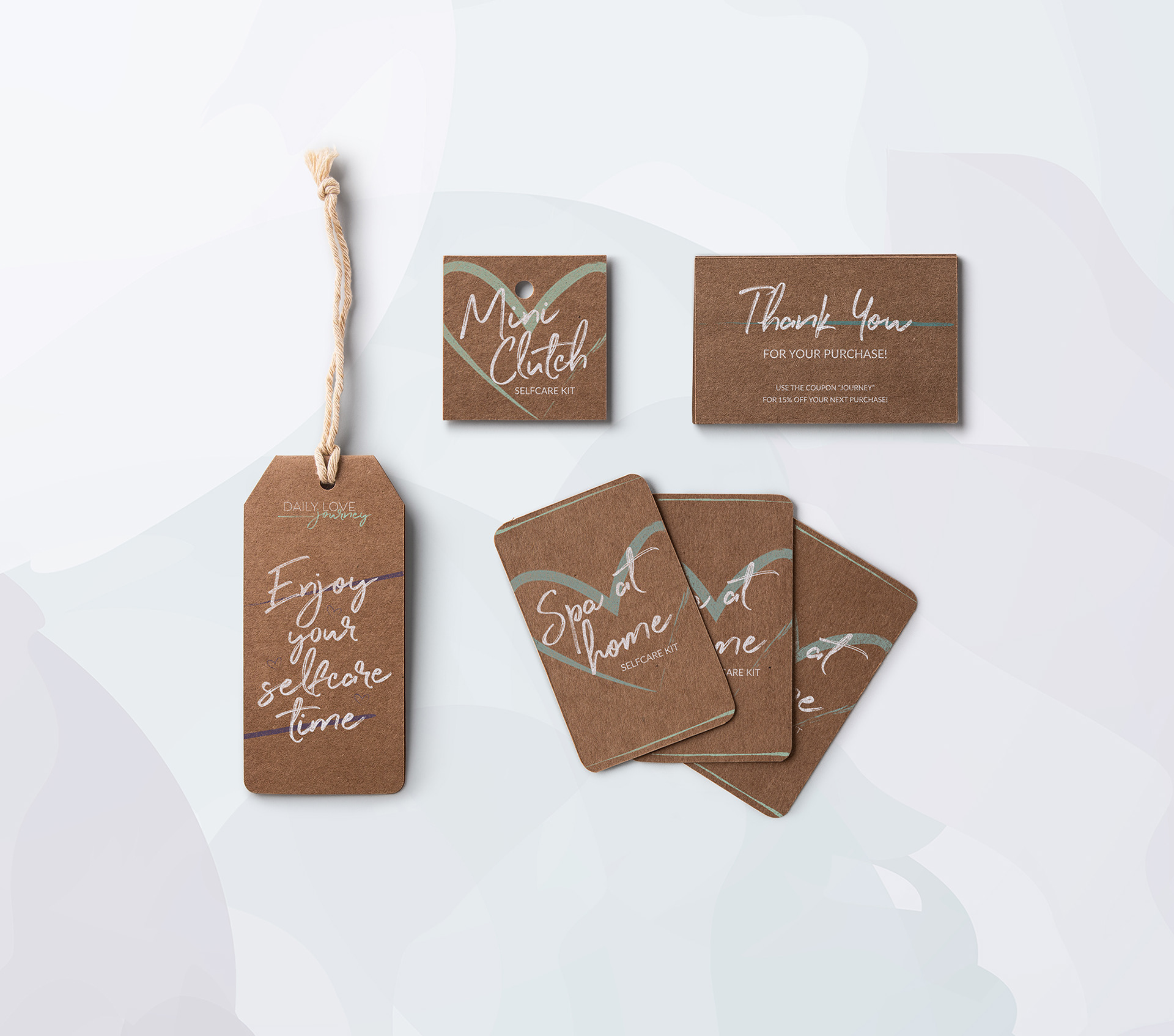
Some label mock ups to see other brand elements in action. This brand includes a few illustrations and decorations that I wanted to be able to display. Below you can see them as the lines and hearts decorating the labels.
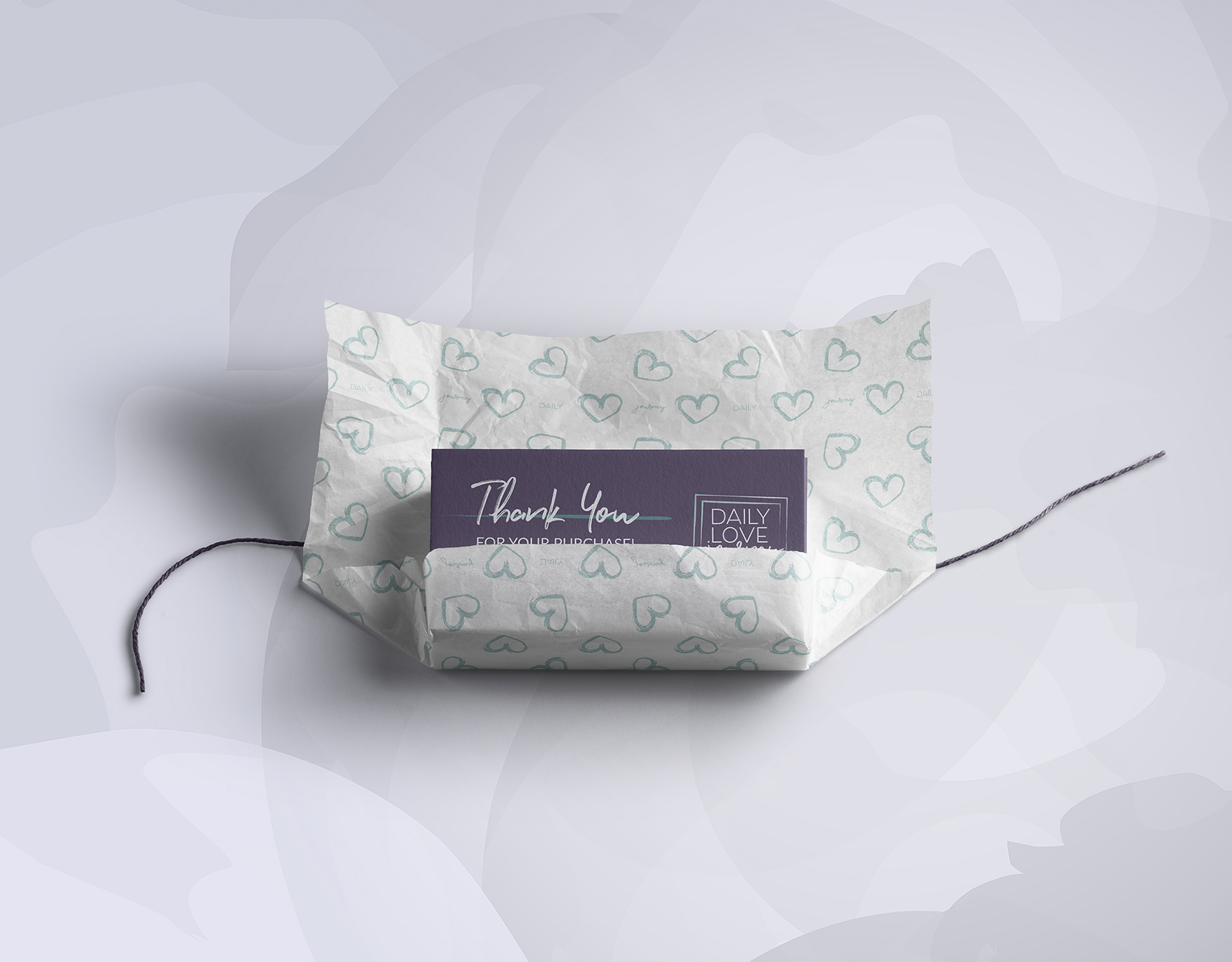
And lastly one of my favorite parts, thank you cards and wrapping paper. The moment I started putting together the glittery hearts texture, I knew I wanted to see it as wrapping paper. It’s perfect for it, don’t you think?
This brand includes so many different elements, it’s beautiful! I got to experiment and make some awesome mock ups to display these individual elements. It was so much fun, and I’m in love with the results. I’m currently completely redesigning the website, which will be an essential part of the brand as well. Can’t wait to see the end result!